Your business needs more leads and visibility.
Our SEO agency generates more revenue and leads for our clients with traffic from Google. If you would like to learn how Keever SEO can take your business to the next level, request a free consultation and we will get back to you today!
100+ Five-Star Google Reviews
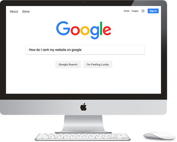
Give your business more traffic and leads by increasing your visibility in Google Search
Experience Digital Agency
We have 20+ years of combined SEO experience
Proven Results
100+ websites ranked across multiple industries
No Commitments
We offer month-to-month contracts. Our results will speak for themselves.
200%
Learn how Keever SEO
could increase your traffic by 200%
On average we have been able to more than double our clients visibility. Are you ready to take your website to the next level?

Stop Losing Clients to Your Competition
We specialize in creating SEO strategies to rank your site above your competitors. We use Google approved methods to ensure your rankings our long term. Give us a call today to see how we can build an effective marketing strategy for your business!
100+
Websites Ranked on the First Page of Google
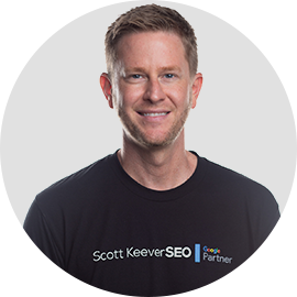
Scott Keever
Internet Entrepreneur & Founder of
Keever SEO
Keever SEO is a search engine optimization company providing data-driven search engine marketing results. Keever SEO is an award-winning SEO agency.
Established in 2015 by entrepreneur, internationally recognized SEO expert, and online reputation management mastermind Scott Keever, Keever SEO is a multi-award-winning digital marketing agency for businesses of all sizes. With a specialization in SEO, Local SEO, and online reputation management, Keever SEO helps clients gain more targeted traffic and revenue through data-driven SEO strategies. Keever SEO is one of the fastest-growing digital marketing agencies in the US and has helped hundreds of businesses secure prominent Page 1 rankings on Google.
As featured In


Here’s Why Our Clients Love Working With Our SEO Company
For All Their Digital Marketing Needs.
Keever SEO has been working in the digital marketing space for many years and knows how to deliver successful results.
With experience working for large companies in the past, Scott now takes great pleasure in helping smaller, local businesses in become more successful.
When you work with us, you are working with the best boutique digital marketing agency in the region. Because we are a based locally, we understand your customers and know how to deliver meaningful results fast.
Larger agencies may have flashier offices and more people on staff, but what matters are results.
We are confident that we can show real, measurable improvements in your sales and increase your online exposure.
One big benefit of using a boutique firm is the personalized attention you will get as one of our customers.
We never compromise in any way on the quality of services we offer, including full service digital marketing offerings equal to any larger agency out there.
Whether you need help with web design, search engine ranking or pay per click advertising, we have you covered.
Some of our customers who have used larger agencies in the past may be to begin with, but quickly understand the quality of Keever SEO:
We have helped hundreds of businesses increase profits! Find out how Keever SEO can help your business by requesting a Free Consultation Now.
Along with years of experience in SEO,
Keever SEO also holds Google certifications for Adwords:

Search
Mobile
Video
Display
Shopping
Analtytics
This ensures that your web presence will be optimized with the most up-to-date and cutting edge techniques.
Are you ready to talk with Scott about increasing your sales and exposure online?
Getting in touch couldn’t be any easier. All you need to do is visit our website and book a free consultation right now.
At a time convenient for you, we can discuss your specific needs and tailor a plan to supercharge your business’ online marketing.
The value you get in this free no-obligation consultation is massive and there is no requirement to continue with the service unless you want to.
Right now, you have several choices. You can keep struggling along on your own or continue using other lesser SEO agencies wondering why you aren’t getting the results you are looking for.
Instead, you can start working with Keever SEO today and see real results fast.
Are You Ready To Dominate Your Competition?
ARE YOU READY TO DOMINATE YOUR COMPETITION?