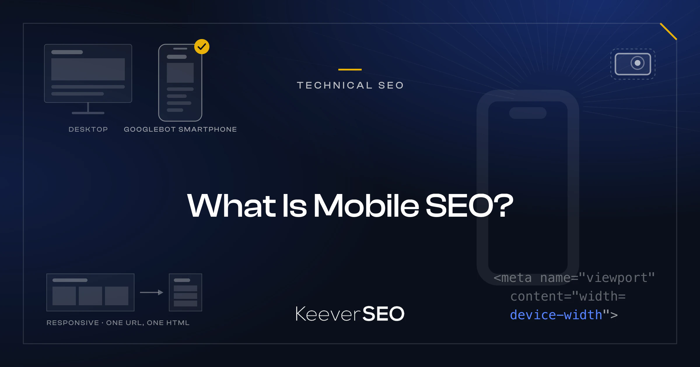
Mobile SEO is the practice of optimizing websites and content for mobile devices like smartphones and tablets. The optimization pursues two goals at once: ranking well in mobile search results and delivering strong usability on mobile devices. Mobile SEO addresses the mobile search engine results page (SERP), where screen space is limited, user intent often differs, and interaction runs on touch rather than mouse clicks.
In the smartphone and tablet SERP, mobile SEO gets websites to appear high in search results and to load fast and read well once tapped. The dual focus matters because search engines like Google now use the mobile version of content for indexing and ranking. The mobile SERP brings fewer listings above the fold, more prominent local results, and rich snippets aimed at on-the-go users who expect immediate answers and fast pages, and mobile SEO accounts for each of those differences to capture mobile search traffic and turn it into engagement.
Mobile SEO is the practice of optimizing websites to raise their visibility in mobile search results and improve the user experience on mobile devices. The practice tailors website content and design to the needs of smartphone and tablet users. The dual goal of mobile SEO is to rank well on mobile search engine results pages (SERPs) and to deliver a strong user experience on smaller screens.
For smartphones and tablets, mobile SEO builds fast-loading, easy-to-use pages that respond to touch and read well without zooming. The work covers responsive web design, page speed optimization, and legible text at native size. As mobile devices carry more of the world's internet access, mobile SEO decides whether a site reaches and holds a mobile audience.
How Does Mobile SEO Differ From Desktop SEO?
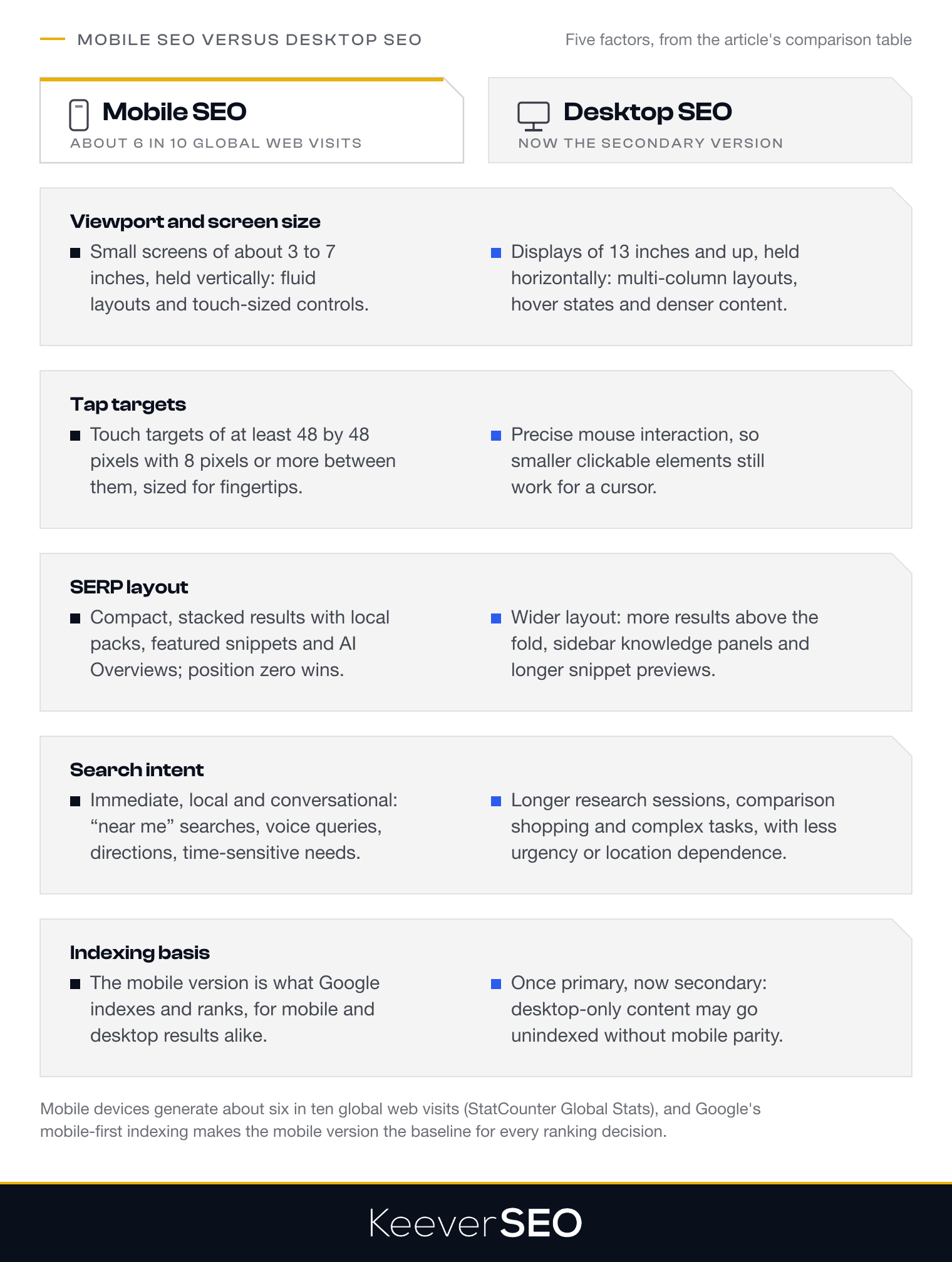
Mobile SEO differs from desktop SEO in viewport, tap targets, SERP layout, search intent, and indexing basis. The differences are compared in the table below:
| Factor | Mobile SEO | Desktop SEO |
|---|---|---|
| Viewport and Screen Size | Built for small screens (about 3 to 7 inches) in vertical orientation, with fluid layouts, scalable images, and touch-sized interface elements that fit limited screen space | Built for larger displays (13 inches and up) in horizontal orientation, with room for complex layouts, multi-column designs, hover interactions, and denser content |
| Tap Targets | Requires touch targets of at least 48 by 48 pixels with spacing of 8 pixels or more to prevent mis-taps, sized for fingertips rather than cursor precision | Built for precise mouse interaction, where smaller clickable elements work because the cursor offers more accuracy than touch |
| SERP Layout | Compact, vertically stacked results with prominent local results, featured snippets, and AI Overviews, where limited space rewards position-zero visibility and quick-answer formats | Wider layout with more visible results above the fold, sidebar knowledge panels, longer snippet previews, and more information per screen |
| Search Intent (On-the-Go/Local) | Immediate, location-based, conversational queries ("near me" searches, voice queries) from users who want quick answers, directions, or time-sensitive information | Longer research sessions, comparison shopping, and complex tasks, with deeper content exploration and less urgency or location dependence |
| Indexing Basis | Google uses the mobile version of content for indexing and ranking under mobile-first indexing, so mobile content, metadata, and structured data decide search visibility for both mobile and desktop | Once the primary indexing source, now secondary to the mobile version; desktop-only content may go unindexed when the mobile version lacks parity |
The sharpest distinction is Google's mobile-first indexing, which made the mobile experience the baseline for all search rankings. Websites that fail to keep content parity between mobile and desktop versions risk ranking losses, because hidden or truncated mobile content shapes what gets indexed. Mobile-specific usability signals, including page speed, Core Web Vitals performance, and the absence of intrusive interstitials, carry weight in Google's mobile ranking, which reflects the fact that mobile devices now generate about six in ten global web visits.
How Does Mobile SEO Work?
Mobile SEO works by making sure Google can crawl, index, and assess the mobile version of a website. Google uses a specialized crawler, Googlebot Smartphone, which emulates a mobile user agent to access and render mobile web pages and analyzes mobile-specific factors such as page speed, viewport configuration, and touch-friendly navigation.
Google weighs mobile usability signals in its rankings. The signals include responsive design, legible font sizes without zoom, adequate tap-target spacing, and the absence of intrusive interstitials that block content. Access to resources such as JavaScript and CSS matters as well, because blocking them prevents proper rendering and hurts rankings.
The mobile SEO evaluation rests on Google's mobile-first indexing, under which Google uses the mobile version of a site for indexing and ranking, and the process is set out next.
What Is Google’s Mobile-First Indexing Process?
Google's mobile-first indexing process is the practice of using the mobile version of a website for indexing and ranking. Google began applying mobile-first indexing by default for new websites in July 2019, and it announced in October 2023 that the rollout to the whole index was complete, in the Google Search Central Blog post "Mobile-first indexing has landed - thanks for all your support." Under the process, Google's algorithms weigh mobile content, metadata, and structured data ahead of desktop versions when deciding search rankings.
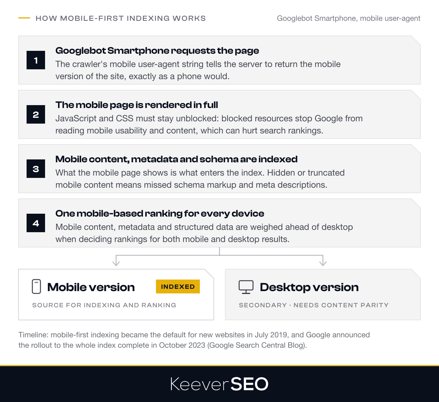
The default status of mobile-first indexing makes mobile optimization a condition of search visibility rather than an option. The process runs through Googlebot Smartphone, whose crawl of mobile pages is described below.
How Does Googlebot Smartphone Crawl Mobile Pages?
Googlebot Smartphone crawls mobile pages with a mobile user-agent string, which tells web servers to return the mobile version of a site. The crawler then renders the mobile content, including JavaScript, to evaluate how the page appears and works for mobile users. Website owners must keep JavaScript and CSS resources unblocked, because Googlebot Smartphone needs the files to render and read the mobile page in full. Blocked resources keep Google from assessing mobile usability and content, which can hurt search rankings.
Why Must Mobile Content, Metadata, and Structured Data Match Desktop Content?
Mobile content, metadata, and structured data must match desktop content because mobile-first indexing uses the mobile version as the source for ranking and indexing. Content parity between mobile and desktop prevents ranking losses from missing or truncated information. When mobile content is hidden or cut down, Google may miss ranking signals like schema markup and meta descriptions. Consistency across both versions keeps every element indexed and protects the site's visibility and search performance.
How Does Google Evaluate Mobile Usability Signals?
Google evaluates mobile usability signals by checking the technical and user experience factors that decide whether a page works on a mobile device. The signals are listed below:
- Viewport Configuration: The page must be sized for mobile screens so content fits the device's dimensions without horizontal scrolling, which depends on correct viewport settings.
- Legible Font Size: Text must be large enough to read without zooming, with a body font size of 16 pixels or larger as the common recommendation.
- Tap-Target Spacing: Interactive elements such as buttons and links must be sized and spaced for touch, at least 48 by 48 CSS pixels with enough spacing to prevent accidental taps.
- Absence of Horizontal Scroll: Pages must fit the device width, because content that forces side-to-side scrolling counts as a usability issue.
Tools like the Mobile-Friendly Test and Google Search Console's Mobile Usability report measure the signals and flag issues such as text too small to read, clickable elements too close together, or a missing viewport meta tag. Pages that meet the usability standards earn better visibility in mobile search results, because Google favors sites that deliver a smooth mobile experience.
What Are the Types of Mobile SEO Implementation?
The types of mobile SEO implementation are responsive web design, dynamic serving, and separate mobile URLs. The three configurations are listed below:
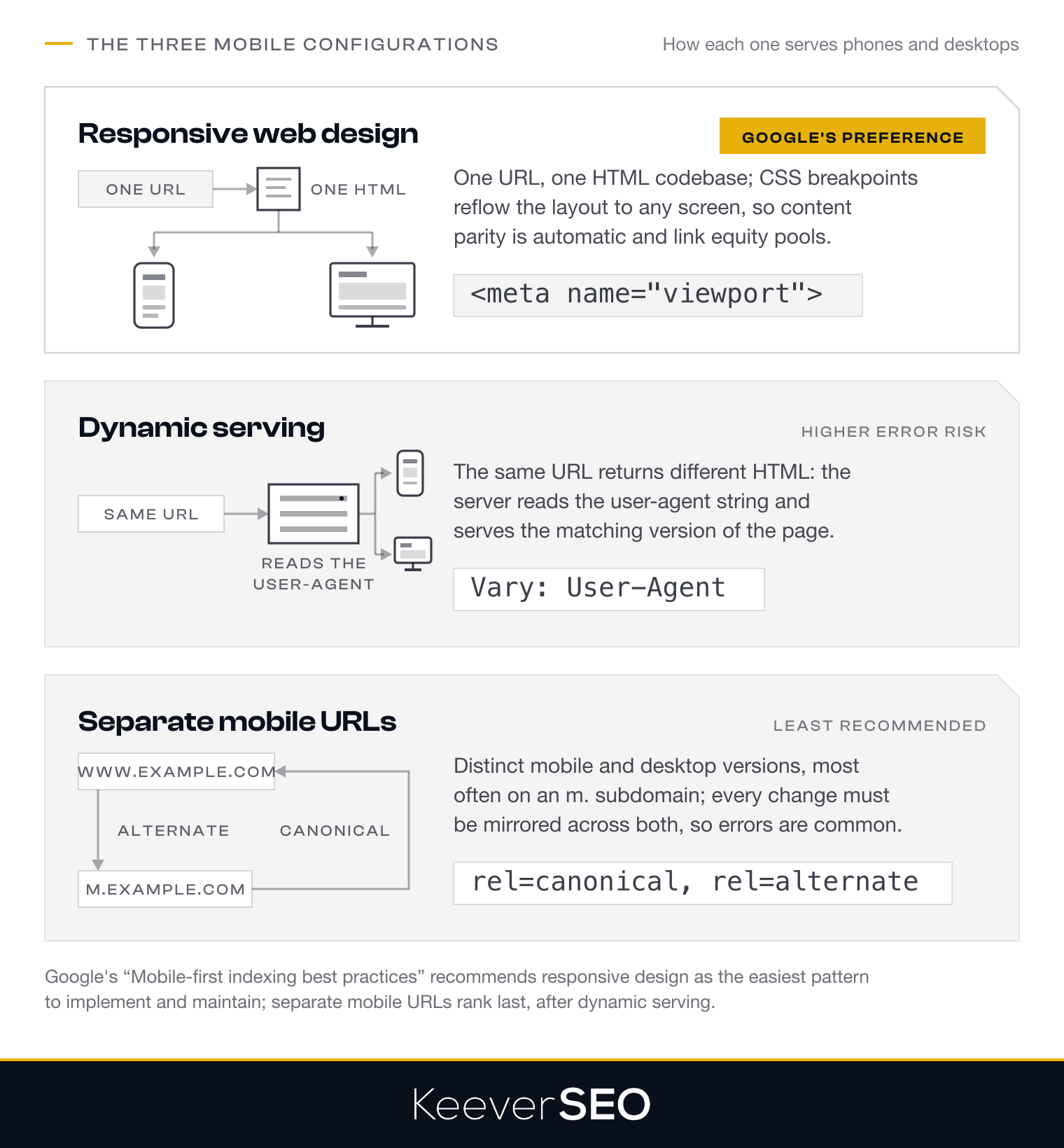
Responsive Web Design Responsive web design uses a single URL and one HTML codebase that adapts to any screen size through CSS breakpoints and flexible layouts. Google prefers the configuration because one codebase serves every device, and content parity follows without extra work, which fits mobile-first indexing.
Dynamic Serving Dynamic serving delivers different HTML from the same URL based on server-side user-agent detection. The approach requires a Vary HTTP header to tell search engines that the content adapts, and it allows device-specific delivery at the cost of more complex server configuration and a higher risk of errors.
Separate Mobile URLs Separate mobile URLs, often on an m. subdomain such as m.example.com, keep distinct versions for mobile and desktop. The method requires rel=canonical and rel=alternate annotations to avoid duplicate content, and it allows a highly customized mobile experience at the cost of heavy maintenance and frequent configuration errors, which makes it the least recommended option.
Responsive web design, the configuration Google prefers, is covered first below.
What Is Responsive Web Design, Google’s Preferred Mobile Configuration?
Responsive web design is a method that adapts one website to every device, from desktops to tablets to smartphones, through a single URL and a single HTML codebase. CSS adjusts the layout by screen size through fluid layouts and breakpoints, so content displays without horizontal scrolling or zooming. The viewport meta tag controls how content scales on mobile devices.
Google prefers responsive web design because one URL simplifies crawling and indexing and cuts the risk of common mobile SEO errors such as duplicate content and blocked resources, while the user experience stays consistent across devices. Google's "Mobile-first Indexing Best Practices" documentation recommends responsive web design because it is the easiest pattern to implement and maintain, and the single URL consolidates link equity, which makes it the most effective choice for mobile optimization.
What’s the Preferred Way to Configure a Website for Mobile?
The preferred way to configure a website for mobile is responsive web design. The approach uses a single URL and the same HTML for desktop and mobile users, with CSS media queries that adjust the presentation by screen size and orientation. Google recommends the method because it simplifies maintenance, removes the need for separate URLs or dynamic serving, and consolidates indexing signals on one URL. The configuration lowers the risk of duplicate content and technical errors, which makes it the most efficient choice for mobile SEO.
What Is Dynamic Serving?
Dynamic serving is a mobile configuration in which the same URL serves different HTML and CSS depending on the user's device. The approach tailors content for mobile and desktop users without changing the URL structure: the server detects the device type through user-agent detection and delivers the matching version of the page. The two technical requirements are listed below:
- User-Agent Detection: The server reads the user-agent string in the HTTP request header to identify the device type and serve the right version of the page.
- Vary HTTP Header: The
Vary: User-Agentheader tells search engines and caching systems that the server's response changes by user agent, which helps search engines index the correct version for each device.
Dynamic serving gives a customized user experience but needs careful configuration to avoid serving the wrong version.
What Are Separate Mobile URLs?
Separate mobile URLs are distinct URLs for the mobile and desktop versions of a website, most often an "m." subdomain such as m.example.com for mobile while the desktop version stays at www.example.com. For proper indexing, mobile pages carry rel=canonical tags that point to the desktop version, and desktop pages carry rel=alternate tags that point to the mobile version. The configuration demands heavy maintenance, because every change in content, metadata, or structure must be mirrored across both versions, and the complexity and risk of discrepancies make separate mobile URLs the least recommended option after responsive web design and dynamic serving.
Why Does Mobile SEO Matter for Search Rankings?
Mobile SEO matters for search rankings because most web traffic now comes from mobile devices and Google ranks sites on their mobile version. Mobile devices account for roughly six in ten global web visits, according to StatCounter Global Stats, which makes mobile optimization a condition of visibility in search results. Google's mobile-first indexing evaluates the mobile version of a website for indexing and ranking, so sites with poor mobile performance lose visibility and traffic.
A website's performance on mobile devices feeds its position in search results. Google weighs load time, mobile usability, and content parity between mobile and desktop versions, and sites that perform well on the three earn higher rankings and more organic traffic. Mobile-friendliness has been a ranking consideration since Google's mobile-friendly update, and mobile-first indexing has since made the mobile version the basis of every ranking decision.
The weight of mobile SEO decides which businesses must prioritize it. Businesses that serve mobile users, above all those with local or on-the-go search intent, must build for mobile to stay competitive in search rankings.
Who Needs Mobile SEO?
The businesses that need mobile SEO are local businesses, ecommerce sites, high-mobile-traffic sites, and service providers. The four groups are listed below:
Local Businesses: Local businesses, including restaurants, retail stores, and service providers, need mobile SEO to capture "near me" searches and local queries, because mobile users who search for nearby solutions carry high intent that turns into foot traffic and conversions.
E-commerce Sites: E-commerce brands must prioritize mobile SEO because a large share of global web traffic comes from mobile devices, and mobile shoppers demand fast load times and smooth navigation, which shape conversion rates and sales revenue.
High-Mobile-Traffic Sites: Websites with heavy mobile traffic, such as news platforms and blogs, need mobile SEO to hold visibility in Google's mobile-first index, because a poor mobile experience costs organic reach and audience engagement.
Service Providers: Professional service businesses, like healthcare providers and legal firms, gain from mobile SEO because potential clients research and make contact on mobile devices, and mobile-friendly websites with accessible contact forms and click-to-call capture leads fast.
How Do You Create Mobile-Friendly Content?
You create mobile-friendly content by following a set of practices that keep content accessible, readable, and engaging on smartphones and tablets. The core practices are listed below:
- Scannable Structure: Use headings, bullet points, and short sections so content can be skimmed on small screens.
- Legible Font Size: Keep text large enough to read without zooming, with a base size of 16 pixels.
- Adequate Tap Target Spacing: Design buttons and links with enough space to tap with accuracy, at a minimum size of 48 by 48 pixels.
- No Horizontal Scrolling: Configure layouts to fit the viewport so users scroll in one direction only.
The practices produce content that works and reads well on mobile devices, and the first of them, short paragraphs, is covered next.
Use Short Paragraphs
Short paragraphs are the first rule of mobile readability. On small screens, long blocks of text look dense and are hard to follow. Short paragraphs of two to four sentences fit the narrow viewport and let users find and grasp information without heavy scrolling or zooming.
Short paragraphs reduce cognitive load as well, which helps readers absorb content during brief, on-the-go sessions. One idea per paragraph keeps the writing clear and holds attention, and the format matches natural reading behavior on mobile devices, where users skim rather than read line by line. Concise paragraphs improve readability, comprehension, and the whole mobile experience.
How Does Mobile Page Speed Affect SEO?
Mobile page speed affects SEO through both search rankings and user behavior. Google treats page load time as a ranking factor, above all for mobile searches where users expect fast access to information. A slow mobile page drives high bounce rates and lost conversions, because users leave before it renders in full, and even fractions of a second matter: Deloitte's study "Milliseconds Make Millions" found that a 0.1-second improvement in mobile site speed raised retail conversions by 8.4%, while delays cut engagement and organic visibility.
Improving mobile page speed rests on three core techniques. Image compression cuts file sizes without a visible loss of quality, which speeds delivery to mobile devices on limited bandwidth. Code minification strips unnecessary characters from CSS, JavaScript, and HTML files, which reduces the data transferred. Lazy-loading defers off-screen images and resources until users scroll to them, which prioritizes above-the-fold content and makes the page feel faster.
Mobile page speed ties into Google's Core Web Vitals, which measure the user experience on mobile devices through Largest Contentful Paint (LCP), Interaction to Next Paint (INP), and Cumulative Layout Shift (CLS), and the three metrics are set out below.
What Are Core Web Vitals for Mobile SEO?
Core Web Vitals for mobile SEO are the three performance metrics Google uses to evaluate loading, interactivity, and visual stability on mobile pages. The metrics and their thresholds are set out in the table below:
| Metric | What It Measures | Good Threshold |
|---|---|---|
| LCP (Largest Contentful Paint) | Loading performance, timed as how long the largest visible content element takes to render on screen | 2.5 seconds or less |
| INP (Interaction to Next Paint) | Interactivity, measured as the time from a user interaction to the next visual update; INP replaced the earlier FID (First Input Delay) metric | 200 milliseconds or less |
| CLS (Cumulative Layout Shift) | Visual stability, tracked as unexpected layout shifts during page load so elements stay in place as content appears | 0.1 or less |
Google's "Web Vitals" guidance on web.dev sets the thresholds as the benchmarks for a good user experience, measured at the 75th percentile of page loads. Meeting the metrics protects search visibility and cuts bounce rates on mobile.
How Does Mobile SEO Support Local and Voice Search?
Mobile SEO supports local and voice search by aligning content with the way mobile users search. Mobile devices are the primary tools for "near me" searches, which reflect immediate needs and local intent. Businesses raise their visibility in local search results with an accurate, complete Google Business Profile that lists operating hours, location, and contact information, and consistent NAP (name, address, phone) data across directories strengthens local SEO further.
Voice search runs on conversational, long-tail queries. Users phrase questions to voice assistants in natural language, such as "find the best pizza near me" or "what is the nearest gas station?" Mobile SEO supports voice search by targeting the conversational keywords and structuring content to answer specific questions in clear, concise form, and FAQ schema markup helps content surface in voice results. AI-driven search experiences now appear on mobile devices as well, and concise, well-structured content earns better visibility in AI-generated answers and featured snippets.
The intersection of mobile SEO, local search, and voice search gives businesses a way to capture high-intent users. Fast mobile pages, clear content structure, and complete local signals let a website succeed across all three channels while meeting the expectations of mobile users who want immediate, relevant results.
How Do Mobile Crawlability and Indexability Affect SEO?
Mobile crawlability and indexability affect SEO by deciding whether search engines can access and rank mobile pages at all. JavaScript and CSS resources must stay unblocked so Googlebot Smartphone can render mobile pages in full, because blocked resources lead to incomplete indexing and misread content, which hurts search rankings.
A mobile-friendly site architecture strengthens crawlability through clean navigation and logical URL structures. Important content should sit within easy reach, with mobile-compatible internal links that let Googlebot discover every page. Sites that bury content behind complex navigation or misuse accordion menus risk having core information overlooked during crawling.
Google's mobile-first indexing prioritizes the mobile version of a site for indexing and ranking, so any crawlability or indexability problem on mobile hits visibility and rankings at once. Regular monitoring through Google Search Console catches crawl errors and blocked resources in time to keep mobile search performance intact.
How Does Structured Data Support Mobile SEO?
Structured data supports mobile SEO by giving search engines detailed, machine-readable information about a webpage's content. Schema markup lets search engines read content and display it as rich results on mobile search engine results pages (SERPs), with elements like star ratings, product prices, and FAQs that occupy more visual space on mobile screens and lift click-through rates.
On mobile devices, where screen space is scarce, rich snippets powered by structured data capture user attention. Schema markup supports emerging search behavior as well, because the structured context lets voice assistants and AI Overviews deliver precise answers. Schema parity between mobile and desktop versions matters for the full benefit: Google's mobile-first indexing prioritizes the mobile version, so structured data present on desktop must exist on mobile too for consistent indexing and rich-result eligibility.
What Are Common Mobile SEO Mistakes?
The common mobile SEO mistakes are the errors that undermine mobile performance and invite ranking losses. The eight mistakes are listed below:
- Intrusive Interstitials and Pop-Ups: Full-screen overlays and pop-ups block content, which produces a poor user experience and can draw ranking penalties.
- Blocked JavaScript and CSS: Blocked scripts and stylesheets keep Google from rendering and indexing a mobile page.
- Non-Responsive Design: Layouts that fail to adapt to smaller screens create usability issues and hurt mobile search rankings.
- Slow Load Times: Heavy pages and unoptimized resources raise load times, which cuts engagement and search performance.
- Content-Parity Gaps: Differences between mobile and desktop content cause indexing issues and ranking discrepancies.
- Poor Tap Targets: Small or crowded interactive elements frustrate users and signal poor mobile usability.
- Unfriendly Mobile Navigation: Complex menus and deeply buried pages hinder user navigation and search engine crawling.
- Missing Mobile Metadata or Schema Parity: Inconsistent metadata and structured data between mobile and desktop versions confuse search engines.
When the mistakes persist, professional mobile SEO help is the next step.
When Should a Business Seek Mobile SEO Help?
A business should seek mobile SEO help when specific signals show that in-house efforts fall short. A persistent decline in mobile search rankings or organic traffic is the primary signal. Repeated failures in Google's Mobile-Friendly Test or Mobile Usability report point to unresolved issues, and stagnant mobile conversions despite rising mobile traffic warrant professional intervention as well.
Further triggers include persistent Core Web Vitals failures, manual actions tied to mobile usability such as intrusive interstitials, and technical limits that block mobile-first indexing requirements. Businesses under competitive pressure, or those planning site migrations or redesigns, should bring in professional services so mobile optimization is built in from the start.
The signals matter because unresolved mobile issues limit organic growth over time, as set out below.
How Can Persistent Mobile Issues Limit Organic Growth?
Persistent mobile issues limit organic growth by compounding ranking losses and cutting visibility in search results. Google evaluates the mobile version of a website for indexing and ranking, so unresolved mobile problems such as slow load times or poor usability reduce search visibility, which lowers click-through rates and traffic volume. The lost visibility turns into lost conversions as users choose competitors with better mobile experiences. Mobile performance shapes search performance as a whole under mobile-first indexing, and even small speed improvements move conversion rates, as the Deloitte "Milliseconds Make Millions" study showed with its 8.4% retail conversion lift from a 0.1-second speed gain, which is why a full mobile SEO audit is the way to find and remove the growth-limiting factors.
What Should a Mobile SEO Audit Include?
A mobile SEO audit should include a usability test, a speed and Core Web Vitals check, a crawlability review, a content parity analysis, and a mobile UX review. The five components are listed below:
- Mobile Usability Test: The test checks whether a site meets Google's mobile-friendly criteria, covering viewport configuration, legible font sizes, adequate tap-target spacing, and the absence of horizontal scrolling.
- Speed and Core Web Vitals Check: The check measures mobile loading performance against Google's thresholds for Largest Contentful Paint (LCP), Interaction to Next Paint (INP), and Cumulative Layout Shift (CLS), and it identifies bottlenecks in image compression, JavaScript execution, and render-blocking resources.
- Crawlability Review: The review confirms that Googlebot Smartphone can access and render mobile pages without blocked JavaScript or CSS files, slow server responses, or broken internal links.
- Content Parity Analysis: The analysis compares mobile and desktop versions so all primary content, metadata, headings, structured data, and images appear on both, which prevents the ranking losses tied to hidden or truncated mobile content.
- Mobile User Experience (UX) Review: The review evaluates navigation patterns, touch-friendly interface elements, intrusive interstitials or pop-ups that break Google's guidelines, readability on small screens, and friction in the mobile conversion funnel.
An effective audit turns the findings into a prioritized action plan, with the most damaging issues first.
How Does an Audit Prioritize Technical, Content, and UX Issues?
A mobile SEO audit prioritizes technical, content, and UX issues by impact versus effort. Technical issues that block indexing, such as blocked JavaScript or CSS resources, come first, because they keep search engines from accessing and reading site content and undermine visibility at the root. Once the technical barriers are cleared, the audit turns to content parity and structured data, which keep the mobile version consistent with desktop and hold rankings steady. UX refinements, such as tap-target spacing and font sizes, follow according to available resources and their potential to lift engagement and conversions. The order removes the largest barriers to search visibility first and makes the audit count.
What Does a Mobile SEO Service Include?
A mobile SEO service includes technical fixes, speed optimization, content parity, structured data implementation, and ongoing monitoring. The five components are listed below:
- Technical Fixes: Resolving mobile crawlability, rendering, and indexation issues so Google can access and read the mobile version of a website, including viewport configuration and unblocked JavaScript and CSS for Googlebot Smartphone.
- Speed Optimization: Improving mobile load times through image compression, code minification, and lazy-loading to meet Google's Core Web Vitals thresholds for LCP (Largest Contentful Paint), INP (Interaction to Next Paint), and CLS (Cumulative Layout Shift).
- Content Parity: Keeping the mobile version's content, metadata, and structured data identical to desktop, which prevents the ranking losses that follow hidden or truncated mobile information.
- Structured Data Implementation: Deploying schema markup on mobile pages for rich results and improved snippets on mobile SERPs, with markup kept consistent with desktop.
- Ongoing Monitoring: Tracking mobile usability signals, Core Web Vitals, mobile keyword rankings, and traffic shifts through Google Search Console and Analytics to catch issues in time.
The five components build the foundation for mobile search performance, covering technical accessibility and a user-friendly page experience so a website stays competitive in mobile-first search.
How Does an SEO Agency Improve Mobile Search Performance?
An SEO agency improves mobile search performance by fixing technical barriers, raising page speed, and optimizing content for mobile. The work starts with technical barriers like blocked JavaScript and CSS resources, which restores compatibility with mobile-first indexing and lets Googlebot Smartphone crawl and render mobile pages. The agency then raises mobile page speed through Core Web Vitals work, with image compression, code minification, and lazy loading that meet Google's thresholds for LCP, INP, and CLS. Content optimization follows, with a scannable structure, legible typography, and proper tap-target spacing for mobile users, plus schema markup that unlocks rich results on mobile SERPs. Through the combined work, we strengthen mobile usability signals, speeds load performance, and aligns content with mobile search intent, which lifts mobile visibility, organic traffic, and conversion rates.
How Should Businesses Choose a Mobile SEO Agency?
Businesses should choose a mobile SEO agency on proven results, transparent reporting, technical depth, industry experience, UX understanding, and measurement discipline. The six criteria are listed below:
- Proven Mobile Results: The agency should show success in mobile rankings, traffic, and conversions, with case studies that report before-and-after metrics for mobile users.
- Transparent Reporting: The agency should deliver clear, regular reports on mobile-specific metrics such as keyword rankings and Core Web Vitals, explain its optimization strategies, and show its ongoing work.
- Technical Depth: The agency should hold expertise in mobile-first indexing, responsive design, and mobile usability standards, with fluency in tools like Google Search Console's mobile usability reports and PageSpeed Insights.
- Industry Experience: An agency with experience in the client's sector knows its mobile search patterns and competition, which shapes strategy for ecommerce, local services, or other verticals.
- Content and UX Understanding: The agency should improve mobile readability and content parity without hurting desktop performance and should refine tap-target spacing and the wider user experience.
- Measurement Discipline: The agency should track mobile-versus-desktop traffic splits, keyword visibility, and conversion performance so its work stays tied to business goals.
An agency that meets the six criteria delivers mobile SEO that lifts search visibility and user engagement.
What Mobile SEO Experience Should an Agency Demonstrate?
A mobile SEO agency should demonstrate proven case studies, recovery experience, Core Web Vitals results, and fluency across implementation types. The case studies should show mobile optimization projects with clear before-and-after metrics for mobile traffic growth, keyword rankings, and Core Web Vitals scores. The agency should hold experience in recovering from mobile-first indexing issues, which means diagnosing and resolving content parity gaps and mobile crawlability blocks.
A strong record in Core Web Vitals, such as cutting Largest Contentful Paint (LCP) and improving Interaction to Next Paint (INP), matters as well. The agency should show proficiency across responsive design, dynamic serving, and separate mobile URLs, so it can fit the solution to each client and adapt to Google algorithm updates and changing mobile user behavior.
How Should Businesses Measure Mobile SEO Results?
Businesses should measure mobile SEO results through the traffic split, mobile keyword rankings, Core Web Vitals, and conversions. The four metrics are listed below:
- Mobile-vs-Desktop Traffic Split: The share of visitors who arrive on mobile devices, read in Google Analytics, which shows the primary search channel and performance differences by device.
- Mobile Keyword Rankings: Keyword positions in mobile search results, tracked in Google Search Console, which can differ from desktop rankings.
- Core Web Vitals: Mobile page experience and load performance through Largest Contentful Paint (LCP), Interaction to Next Paint (INP), and Cumulative Layout Shift (CLS), which feed Google's page experience signals.
- Conversions: Mobile leads, sales, sign-ups, and other goal completions, which connect mobile search visibility to business outcomes.
Google Search Console and Google Analytics serve as the primary tools for the four metrics, and the framework sets up how agencies report mobile visibility, traffic, and conversions to clients.
How Do Agencies Report Mobile Visibility, Traffic, and Conversions?
Agencies report mobile visibility, traffic, and conversions through structured, recurring reports on a weekly or monthly cadence. The reports run on dashboards, built in platforms like Looker Studio or proprietary systems, that pull data from Google Search Console, Google Analytics, and rank-tracking tools and separate mobile metrics such as organic sessions, keyword rankings, and conversion rates from desktop data.
Our SEO performance agency ties the metrics to business outcomes, showing for example how a faster mobile page correlates with a rise in mobile conversions. Narrative analysis in each report explains the changes, why they matter, and the recommended actions to hold and extend the gains, so stakeholders read the direct effect of mobile SEO investment on growth.
How Does Ongoing Optimization Sustain Mobile SEO?
Ongoing optimization sustains mobile SEO through continuous monitoring and adaptation to algorithm and device changes. Regular tracking of mobile rankings, usability errors, and page speed surfaces issues that could hurt search visibility in time to fix them, in a repeating cycle of measurement, diagnosis, implementation, and retest.
Continuous improvement is necessary because mobile technology and user behavior keep changing. Mobile SEO must adapt to new devices, screen sizes, and search engine requirements. Regular audits catch emerging problems such as crawlability issues, page speed degraded by added scripts, or content parity gaps, and algorithm updates that touch mobile page experience and Core Web Vitals call for prompt adjustment to hold competitive visibility.
Treating mobile optimization as an ongoing priority preserves and extends mobile search visibility, which keeps mobile SEO effective for both search rankings and the user experience.